Aspen Dental + ClearChoice — app design review & process
Both apps built out around the approved v13 direction (per our 7/12 call) — each within its own brand — plus the full design evolution to date, the source-of-truth references, the Figma feedback, and the DO / DO NOT principles that guide every decision. Prototype v1 with your feedback — not yet the locked design system.
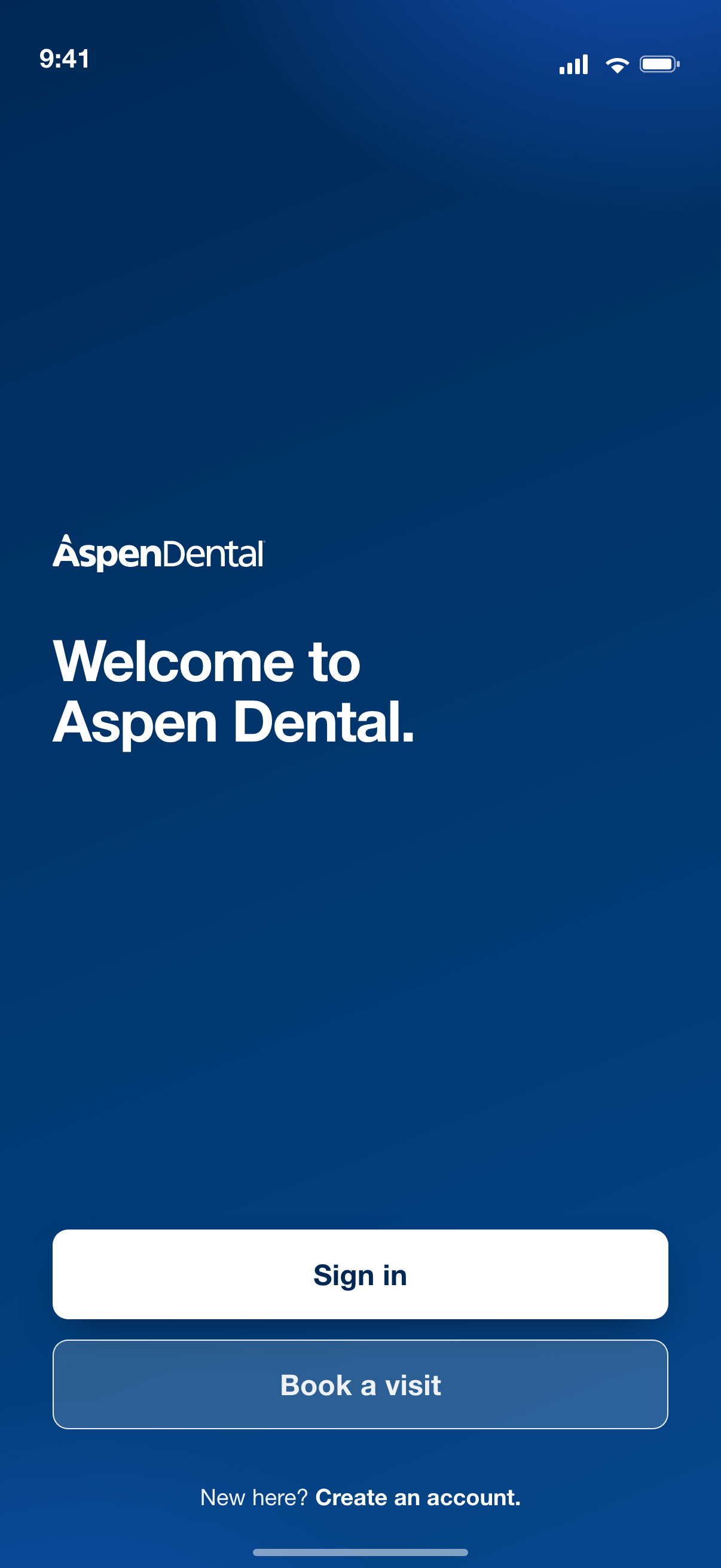
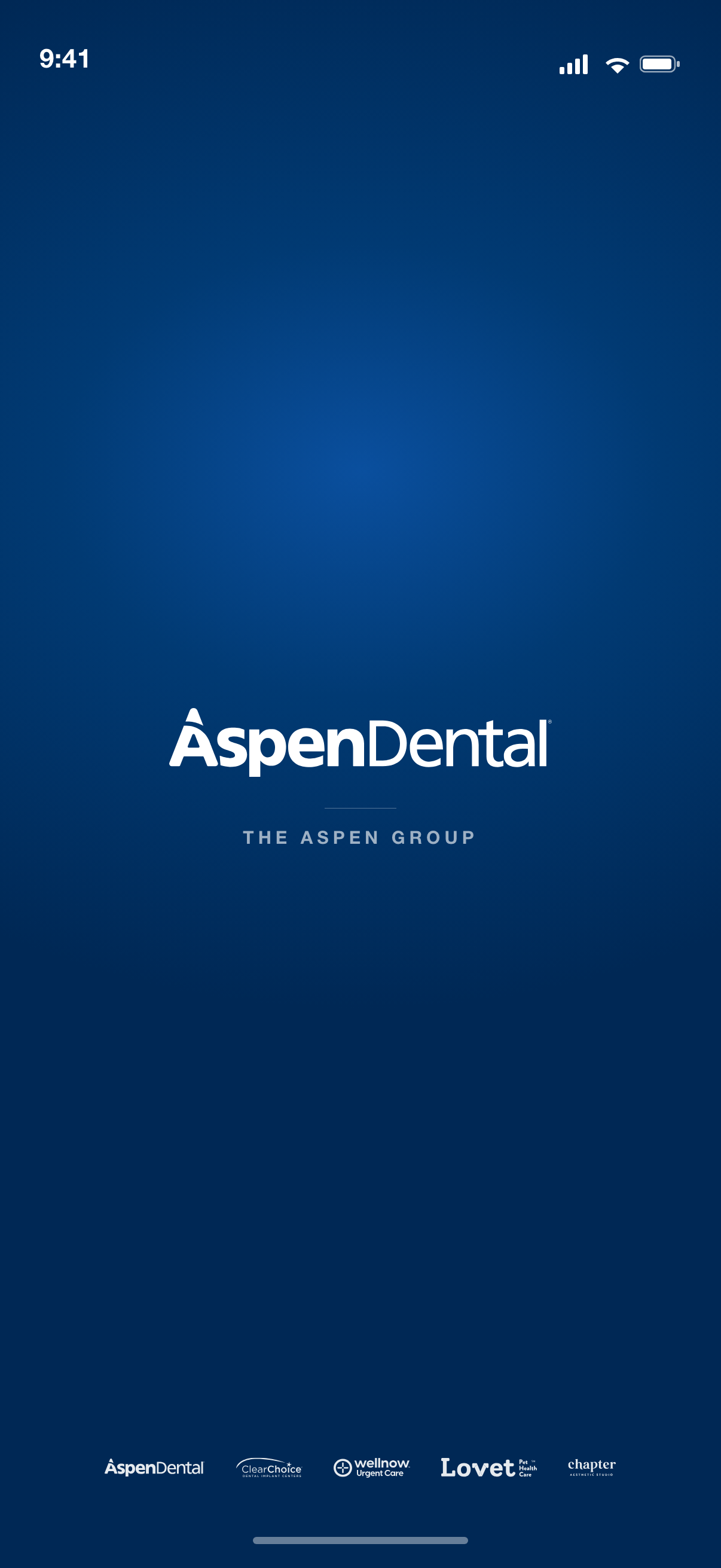
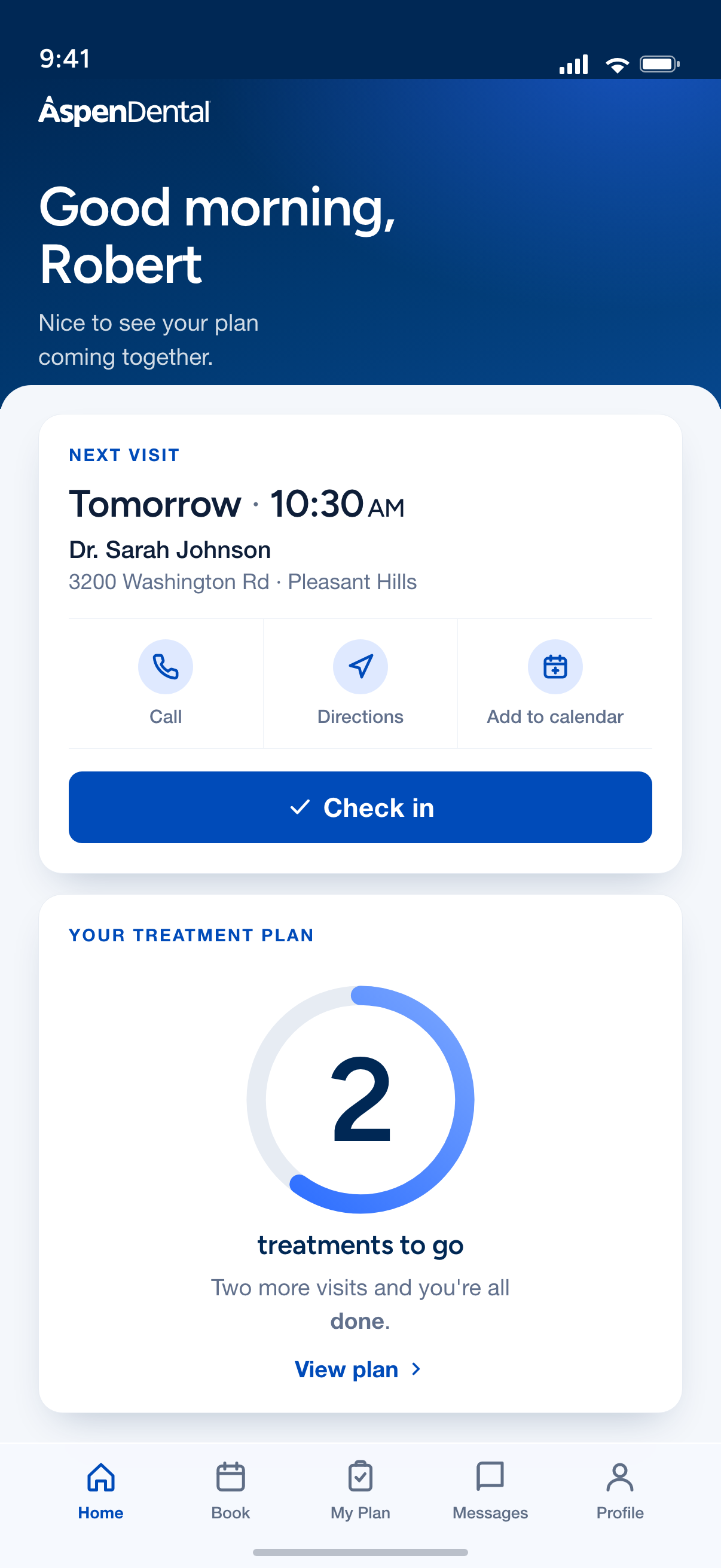
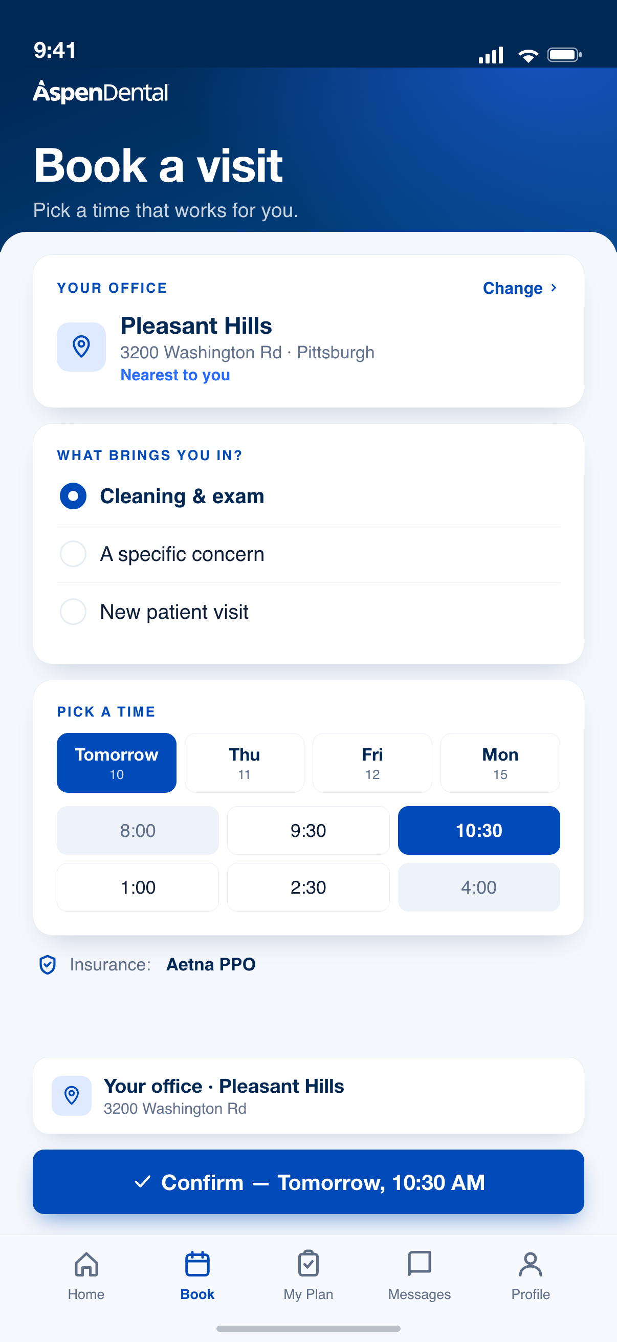
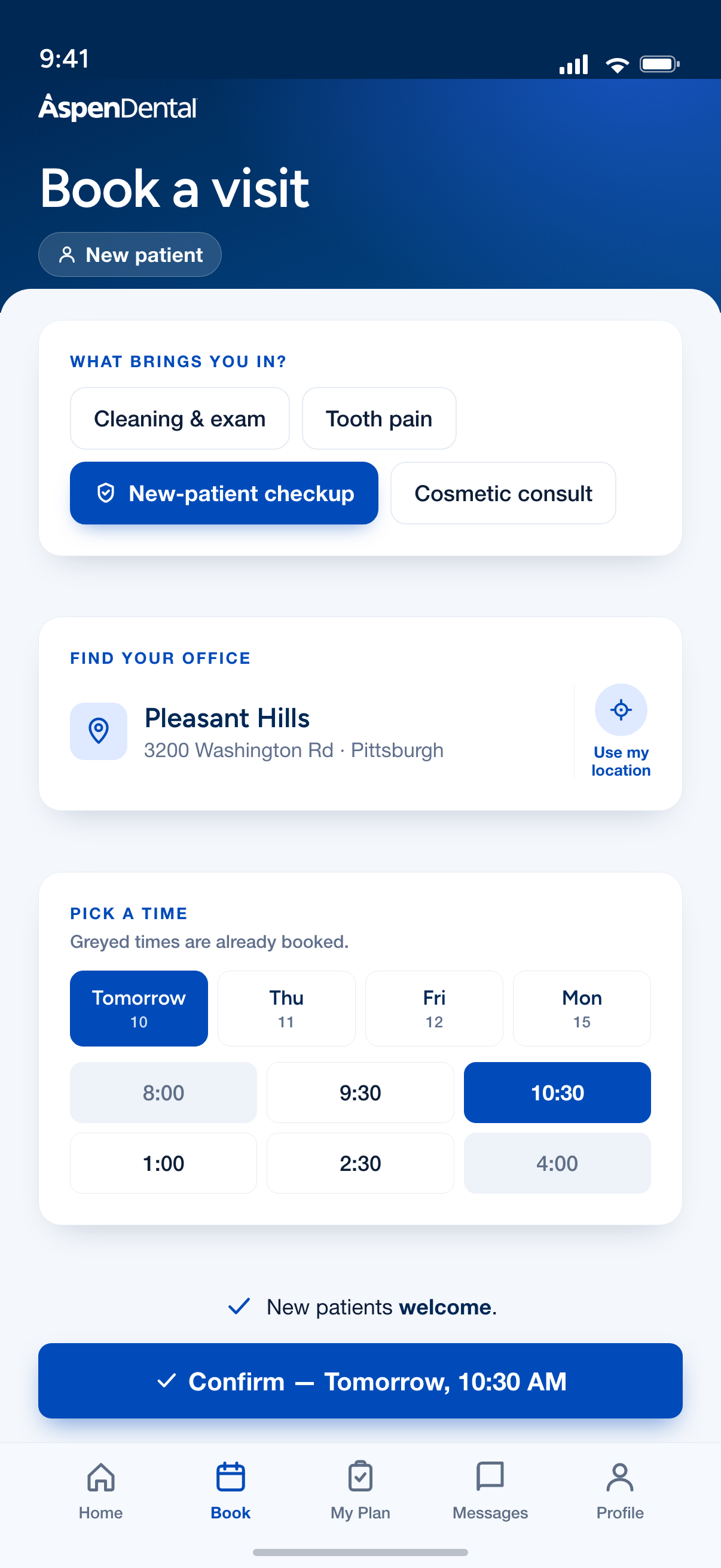
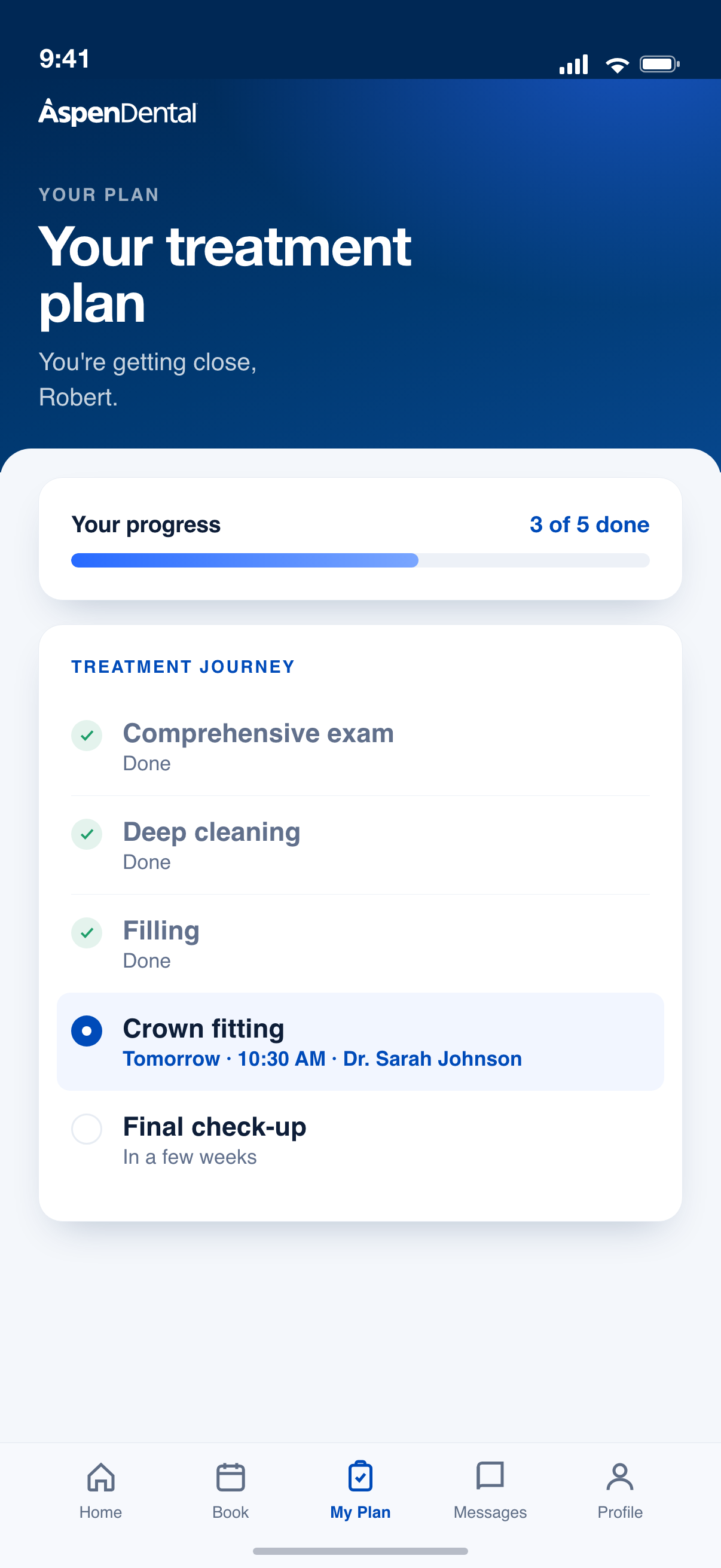
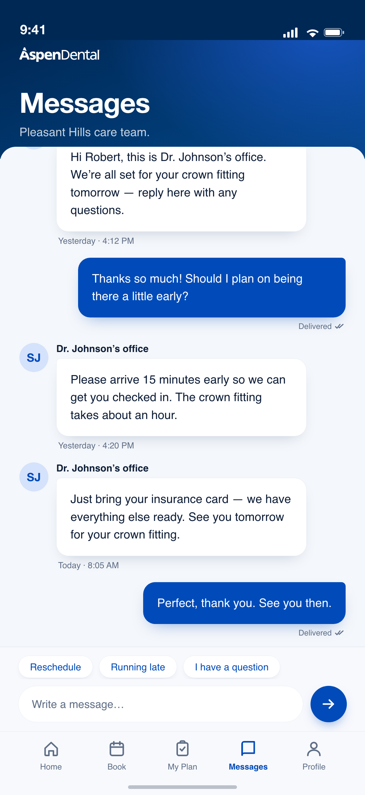
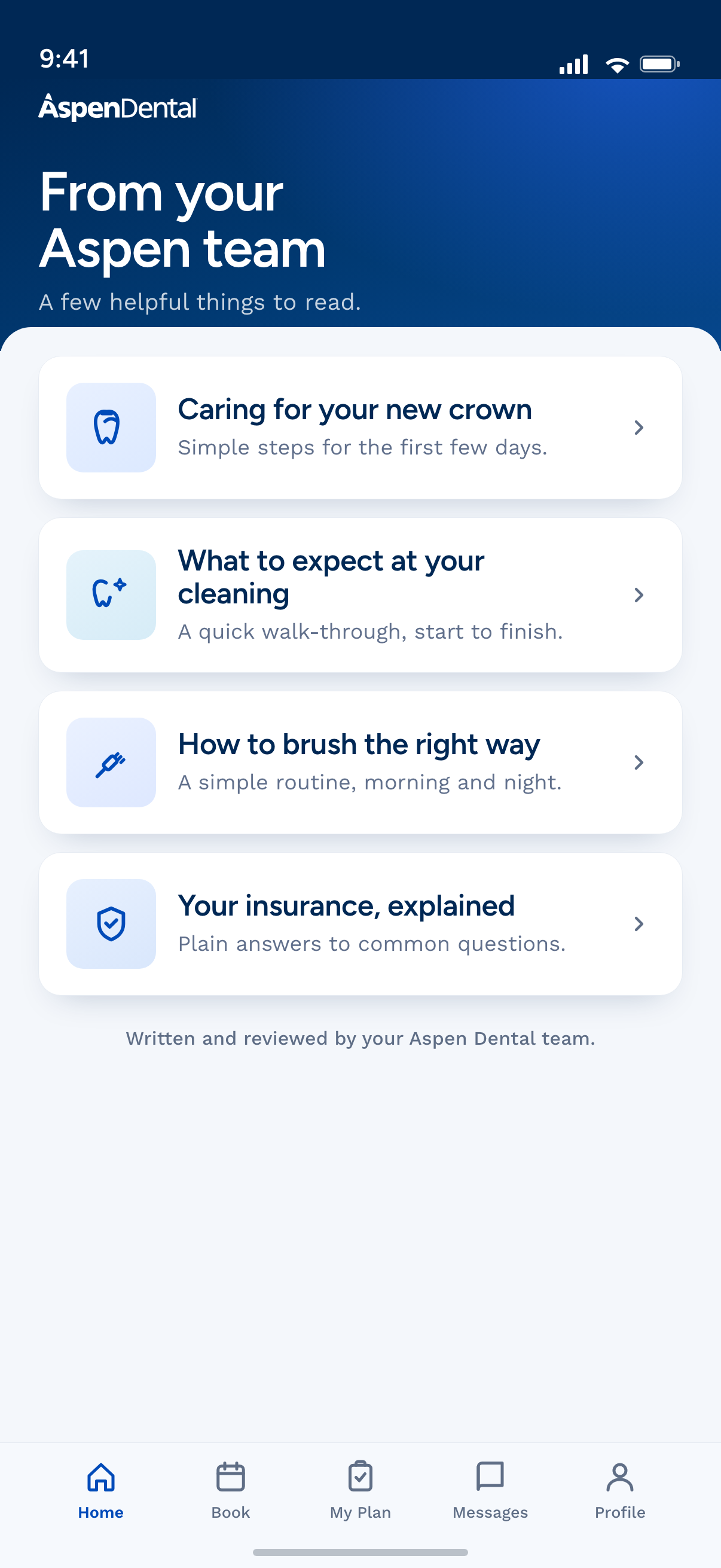
The app, built out — one system around the approved v13
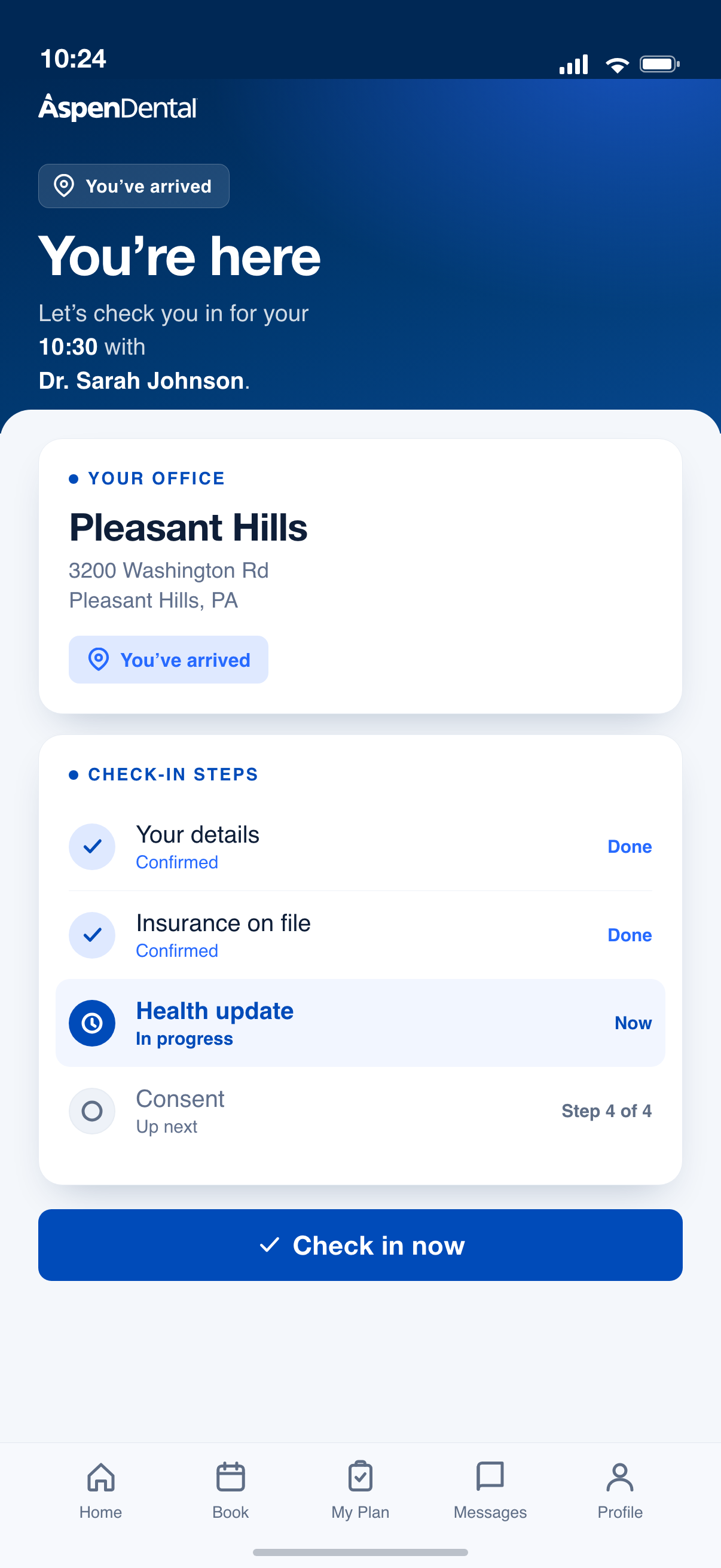
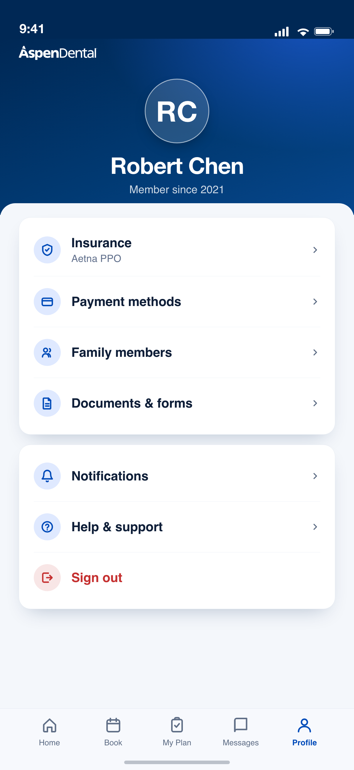
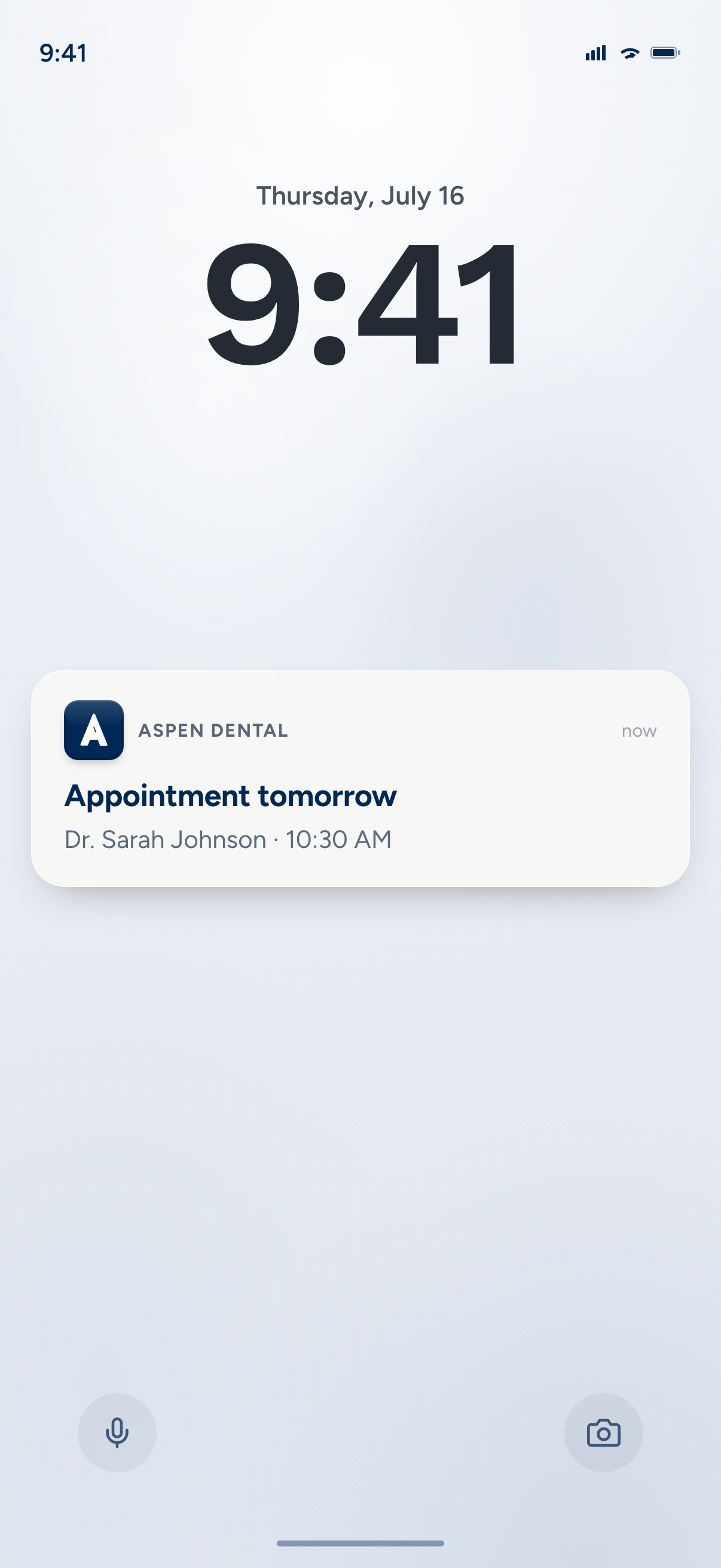
The full flow, every screen built from the July-9 approved home. Simple and literal, authentically Aspen, native iOS with depth (not a website), the nav named for what it does. Tap any screen for full size.
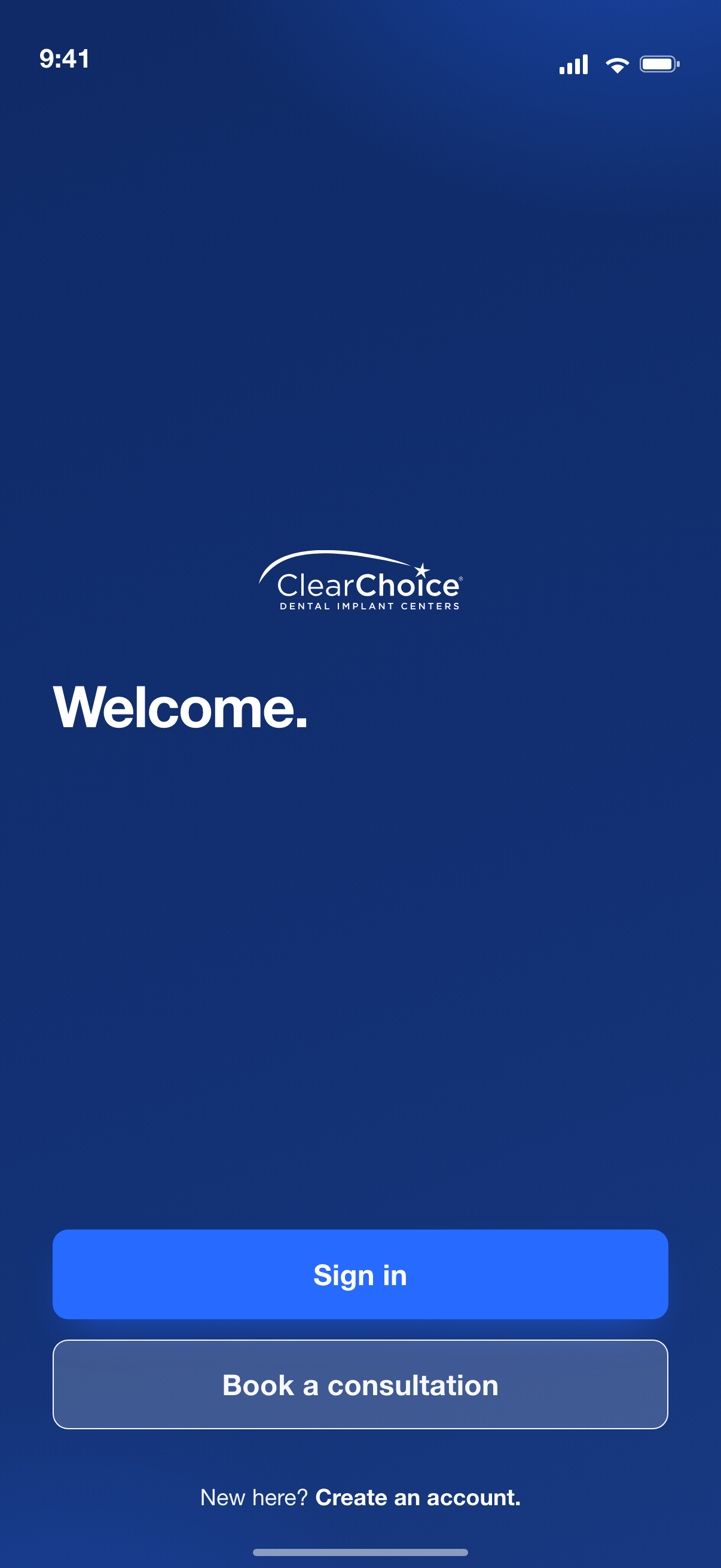
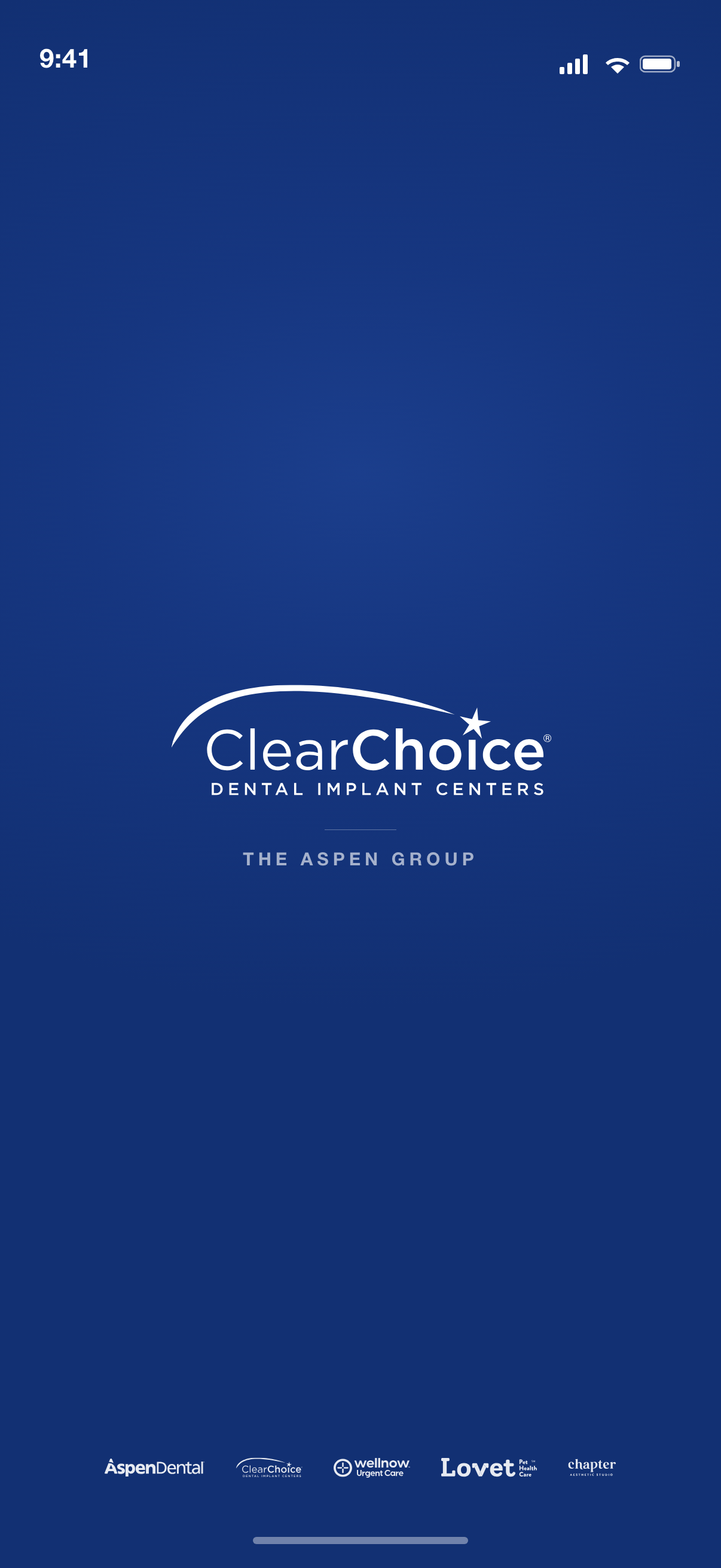
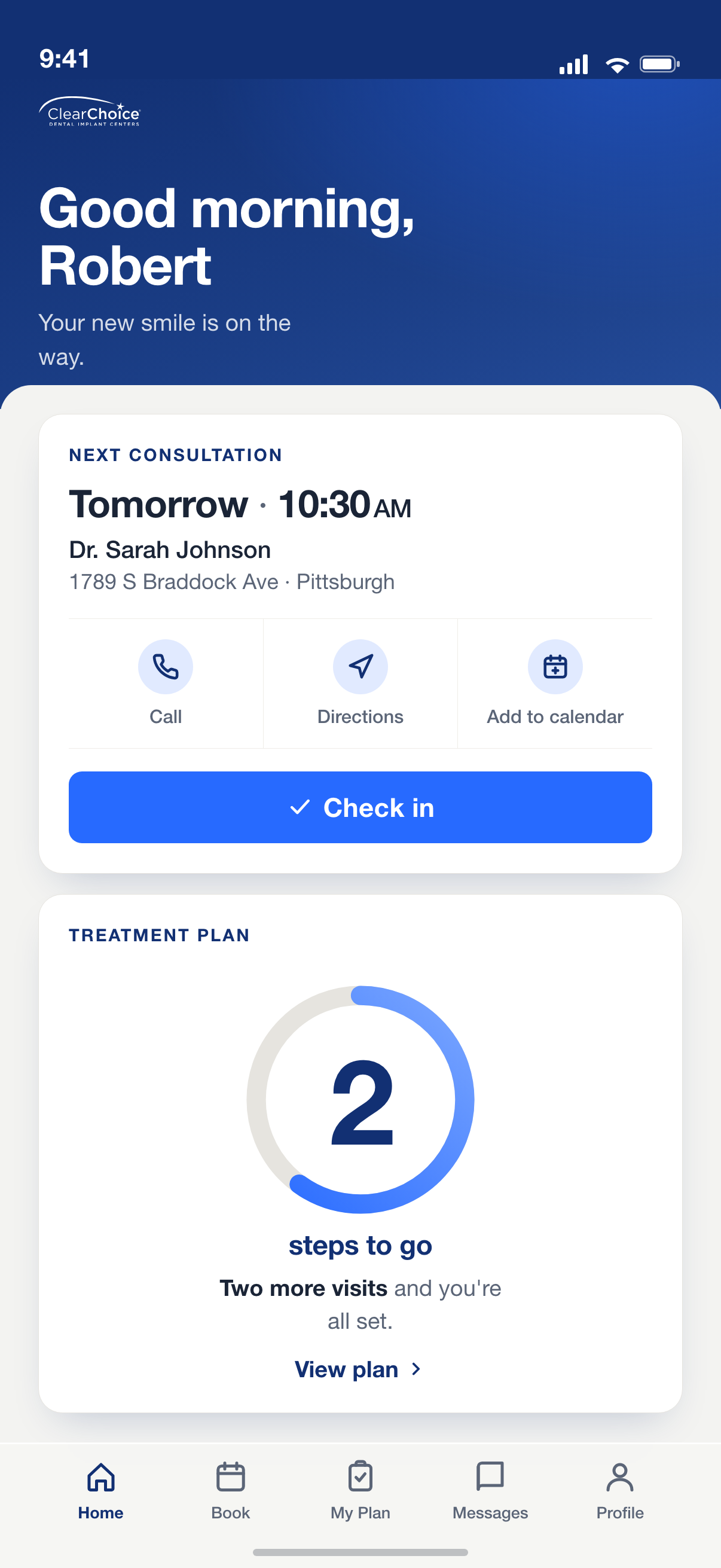
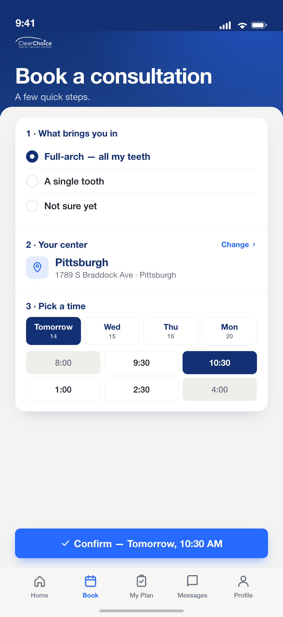
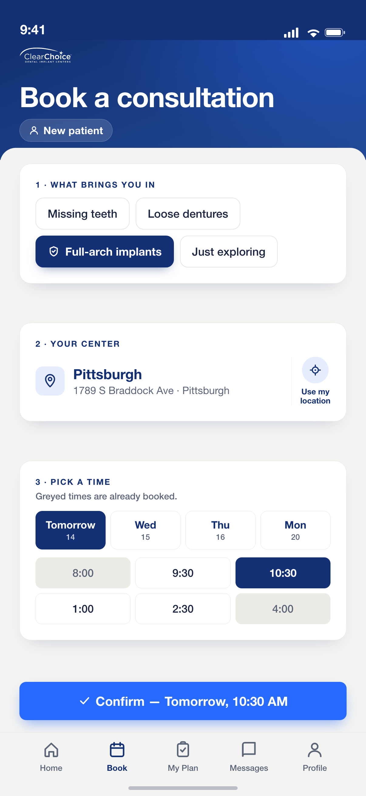
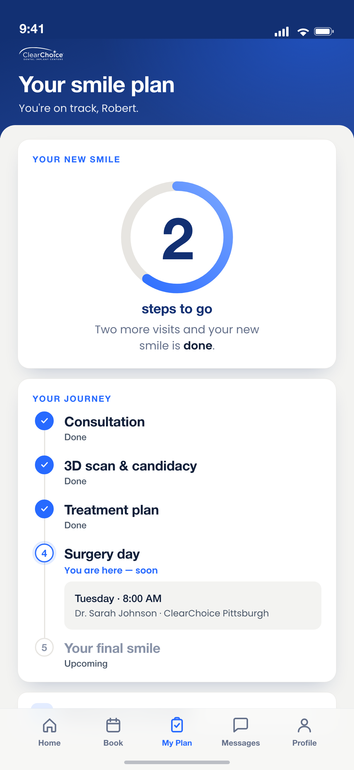
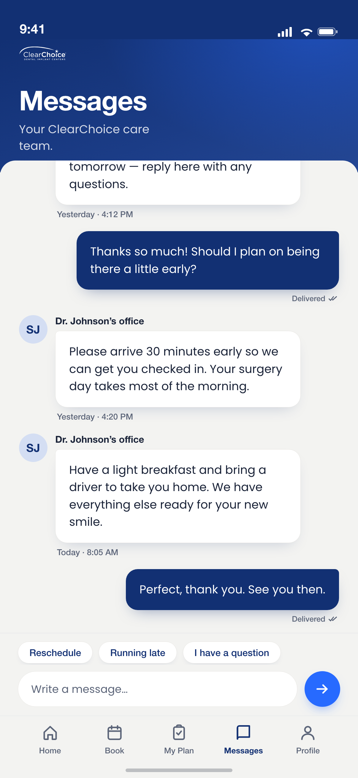
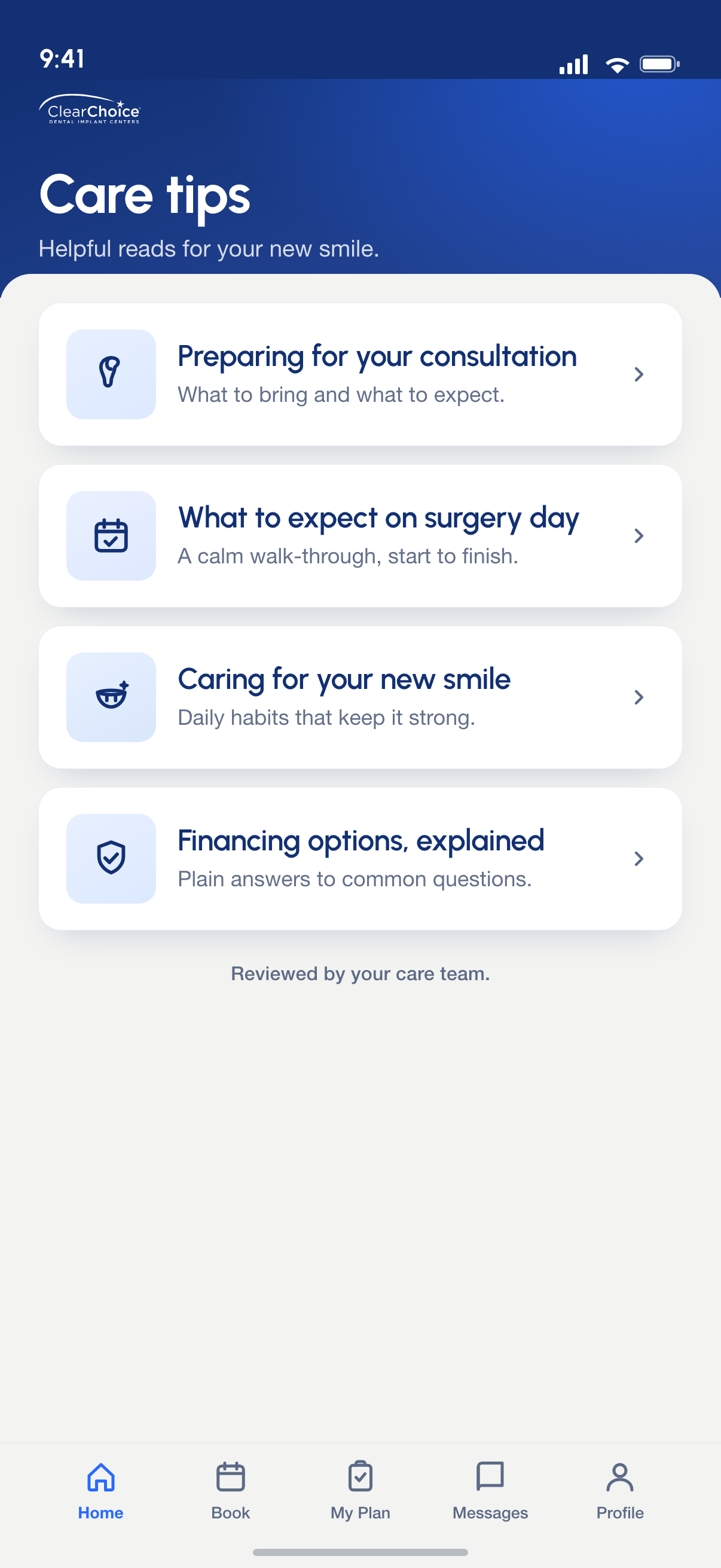
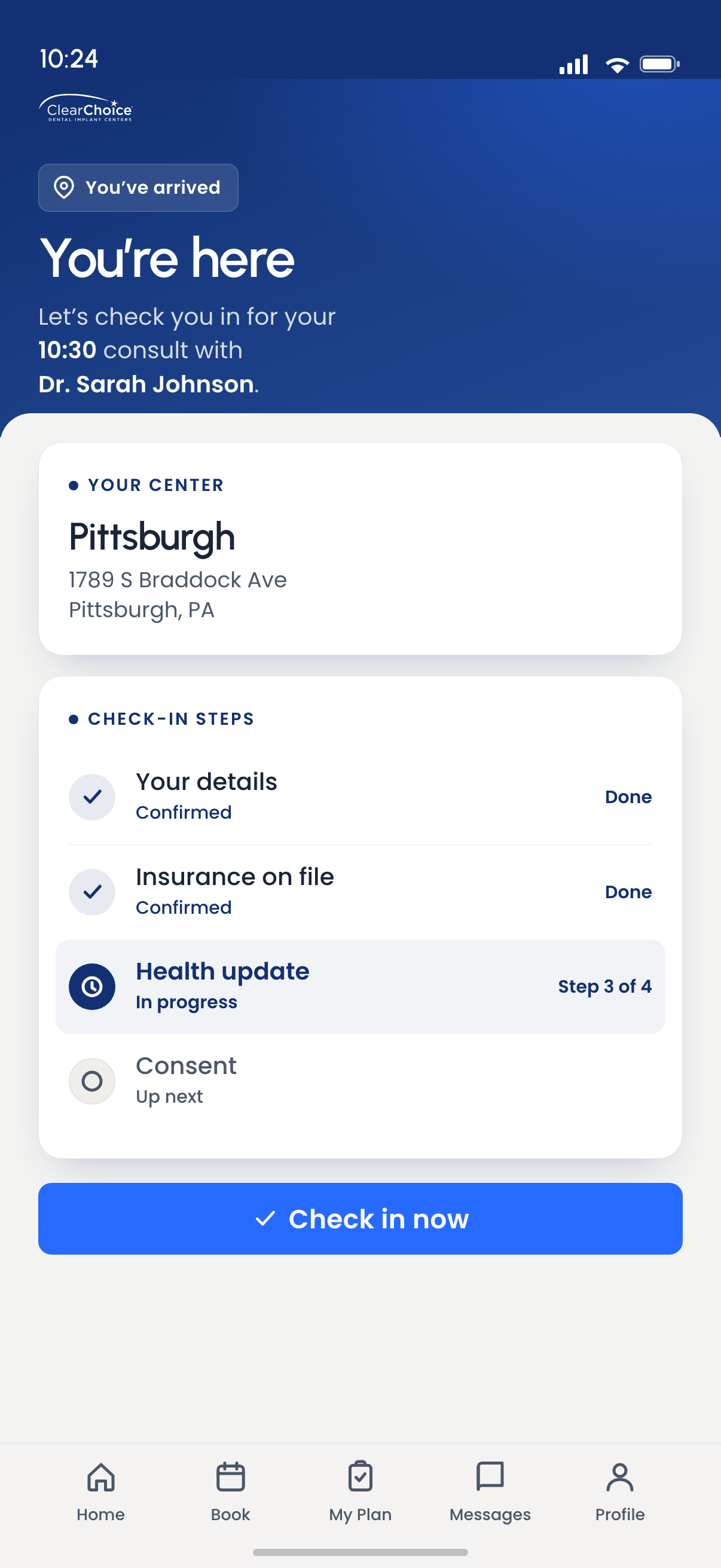
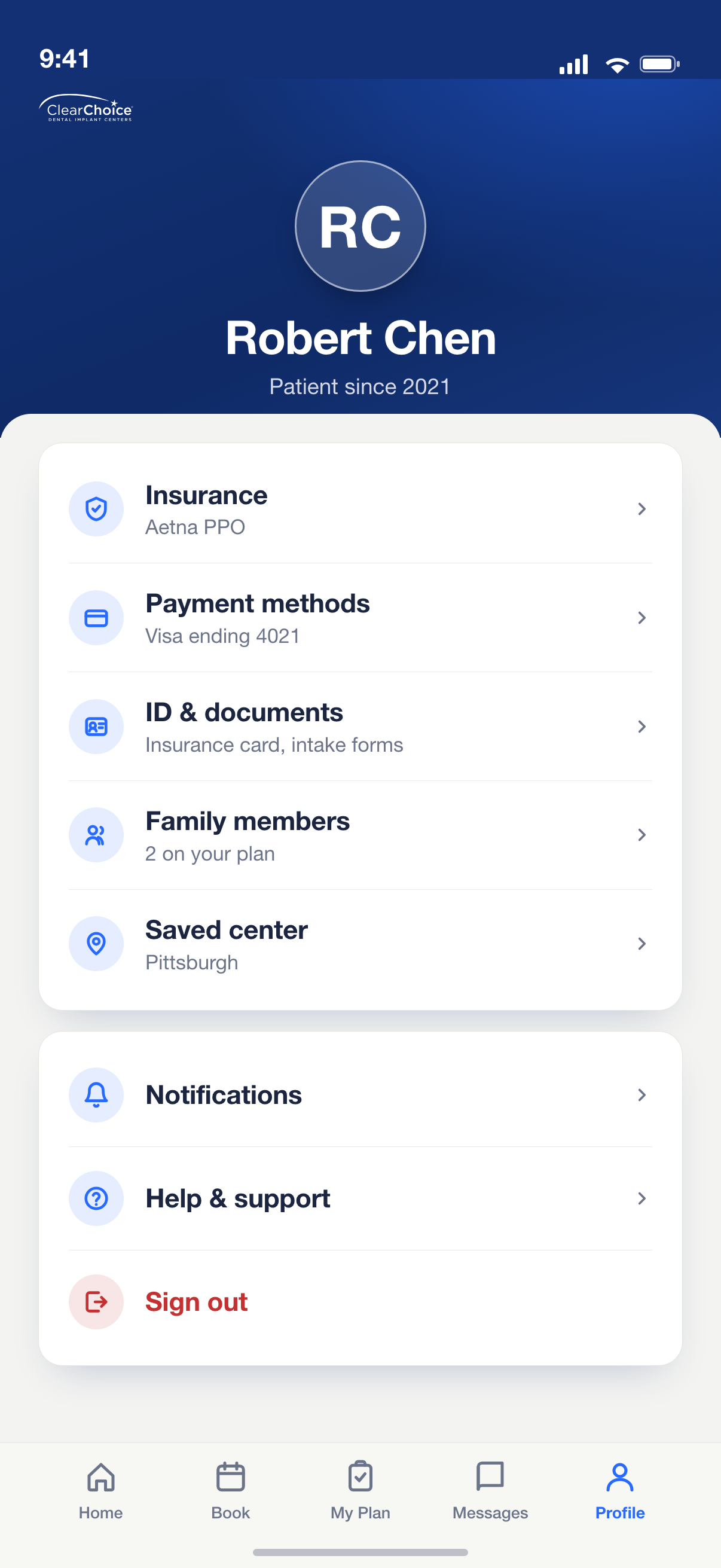
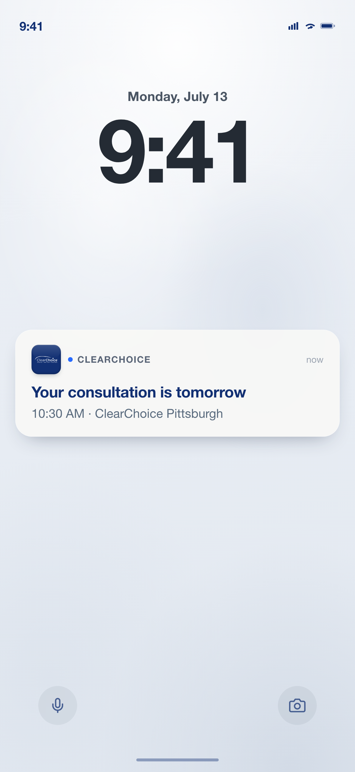
The ClearChoice app, built out — the same decisions, in ClearChoice’s brand
Every decision from the Aspen work applied to ClearChoice, inside ClearChoice’s own guidelines — deep navy #123073, Momentum blue #276AFF reserved for the primary action, dial and active tab, and Urbanist + Poppins type. Same eleven screens, same literal nav, same numbered “you are here” journey. Tap any screen for full size.
The 7/12 call — direction, now built
The direction from our call, and how the build above answers each point.
Launch timeline — still on track for Sept 15
Your prototype feedback is folded in without moving the date. What you're seeing is the approved prototype (v1) — the official design system for both brands gets locked right after the 7/16 review.
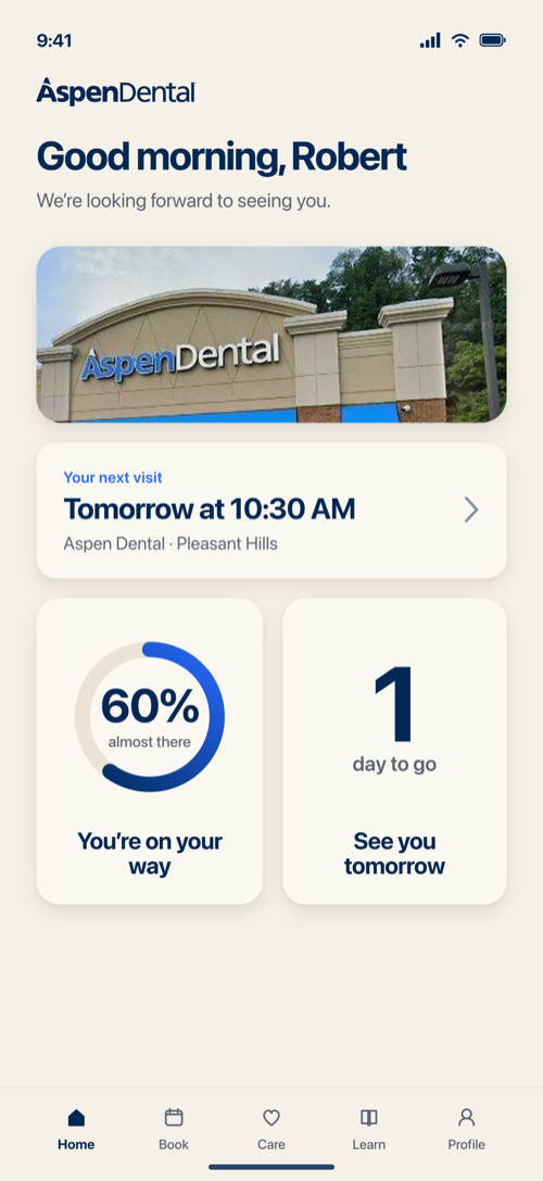
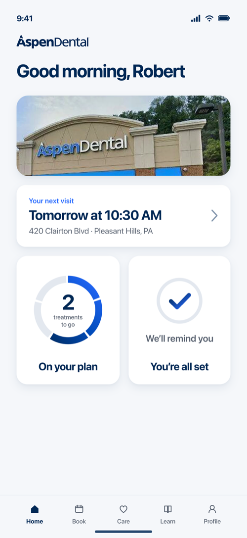
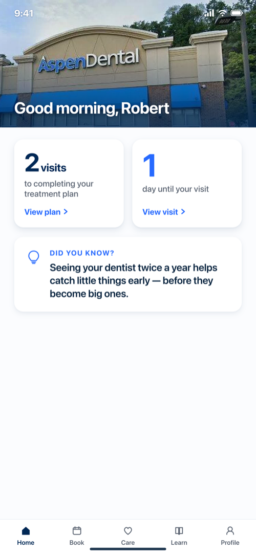
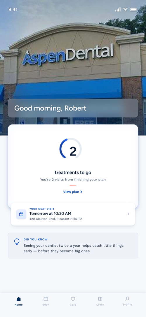
Design evolution — every version, to date
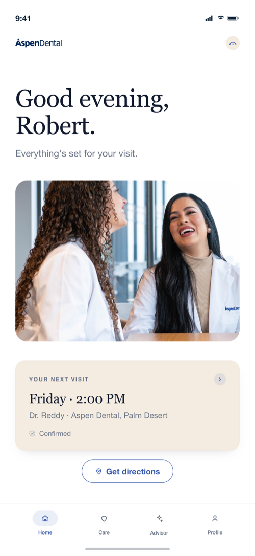
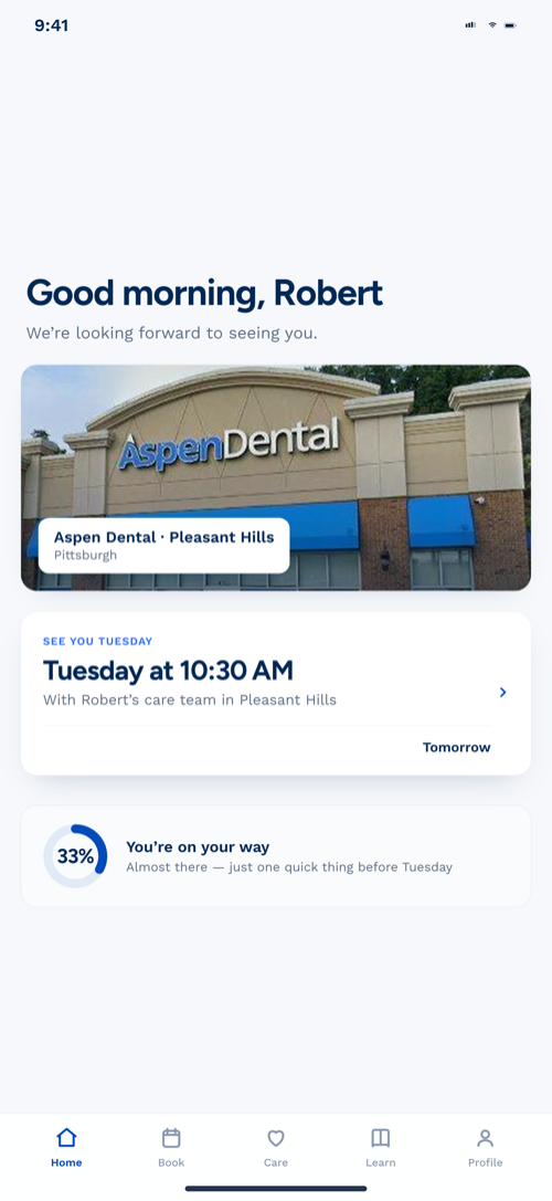
Each round below (Aspen Dental home screen), in order, with the date, who reviewed it, and how it scored against the DO / DO NOT principles. Each round also produced matching launch, care, booking, check-in, and reminder screens.
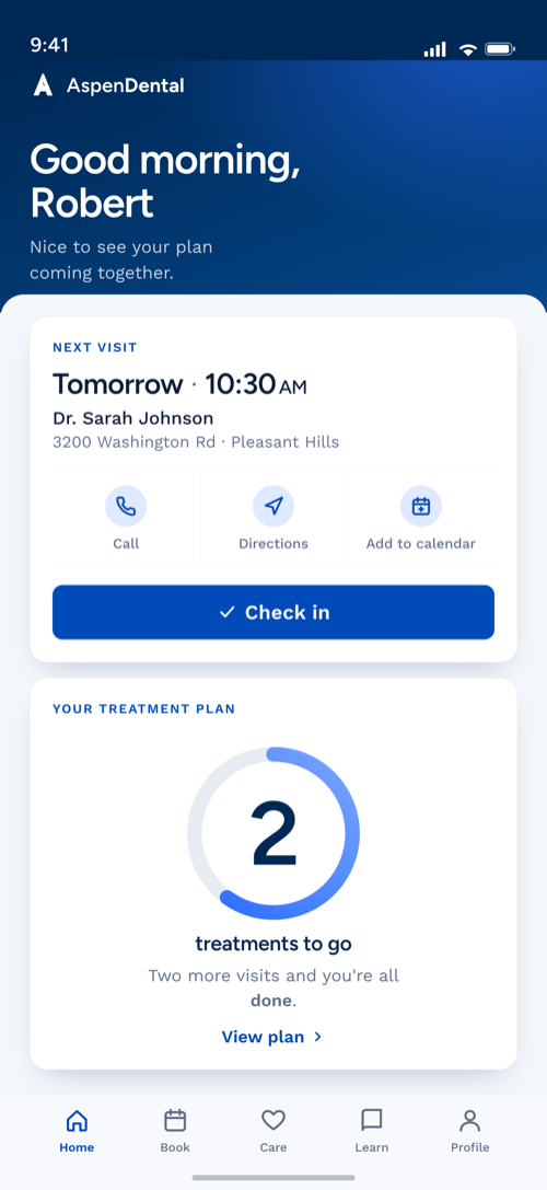
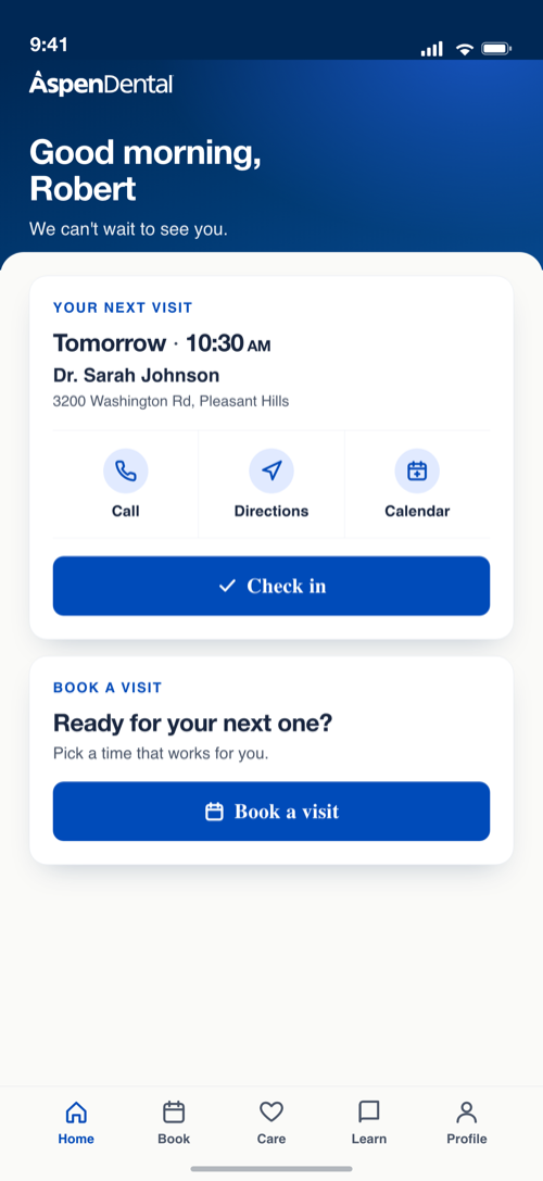
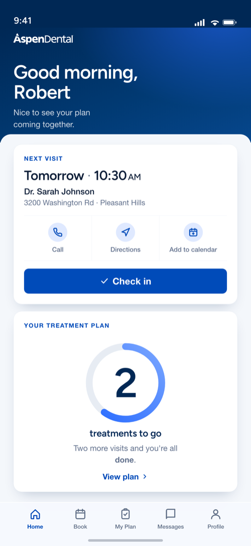
Design decisions we reconciled
A handful of choices took a few passes to settle. Here’s where each one landed — the principles that now guide the build.
The qualities the feedback established — and how this design meets them
The through-lines across every round, and how the current screens reflect each.
Source references we aligned to
The brand and experience references TeamTAG provided. Links open the original; several sit in TAG-owned Figma / SharePoint and need TeamTAG access.
Figma & design-audit feedback
Feedback TeamTAG left in Figma, and the design audit that shaped the brand-alignment direction.
The principles we build to
Distilled from all the feedback above — the checklist behind every screen.
✓ DO
- Be authentically Aspen — real AspenDental wordmark + Northstar-A, brand navy.
- Keep it simple & elegant — one story per screen, room to breathe.
- Feel like a native iOS app — real status bar, tab bar, Apple Liquid Glass.
- Write plain, literal copy — say exactly what it is.
- Use relative days — “Tomorrow,” “Today.”
- One bright accent per screen — deep blue used sparingly.
- Big, legible type, high contrast, large tap targets — for our patients.
- Use the real fonts — Figtree + Work Sans.
- Hold the premium bar — Royal Caribbean, Hims, Ralph Lauren, Burberry.
- Enhance the approved design — never regress its craft.
- Stay focused — a few tight screens at a time.
✕ DO NOT
- No cute or AI-flavored copy — no filler.
- No website look — no web padding, gutters, or spacing.
- No serif fonts — anywhere.
- No stock people photos — a location facade if imagery is needed.
- No pills or stacked loud buttons — no button-on-button.
- No cost, price, balance, or financing — anywhere.
- No redundant or repeated content.
- No cream or tan — it’s a pearly-white brand.
- No gold or brown — that isn’t Aspen.
- No weekdays or calendar dates in app copy — relative days only.
- No over-engineered or confusing elements.
- No placeholder or fake logo — the real mark only.
Reviewer names are TeamTAG team members who gave input across the rounds.